I’ve been working on the cover illustration for my board game for the last 2 weeks (or something) and I thought that this might be a nice time to go through my work flow a bit. I’ll try leading you through the process step-by-step. Hope you enjoy it!
When working on a project where many assets need to be produced, you sometimes don’t end up spending long time on a larger painting for a while. There a both good and bad aspects of this but it’s always nice to be able to put a lot of effort in a single image. Hopefully I’ll have time to do some nice large paintings for a change when this prototype is taken care of.
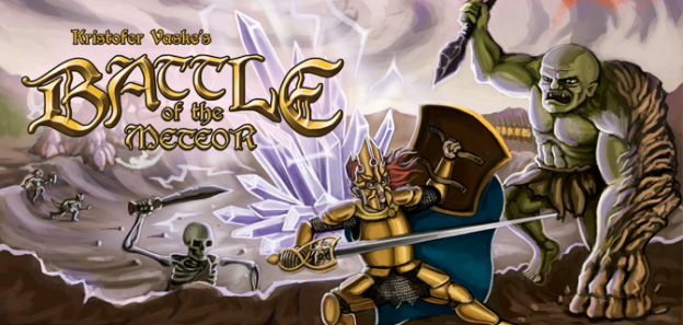
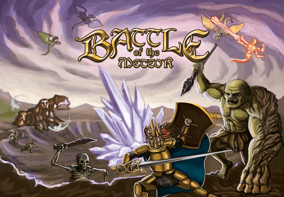
The cover image for this board game did feel like a bit of a challenge to create since I wanted to fit a lot of objects in the same picture. I wanted to highlight the fact that the game has several different factions to play with and I also didn’t want anyone to feel that their favorite faction was left out. At the same time I needed to make sure that the image didn’t feel too chaotic and messy. Because of this I tried to put effort into finding a nice composition that made the image feel balanced and easy to read. First – Here’s a step-by-step GIF image of the painting process:
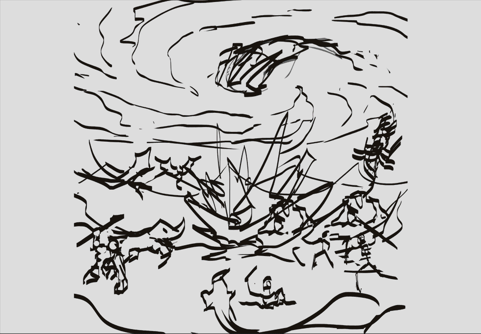
In the first frames you can see how I worked my way into the composition that I ended up sticking with and you can even see a frame where I put a “rule-of-thirds” and “fibonacci spiral” -image on top of it. I am in no way an expert on composition, but this was a try on my part for getting a somewhat good start.
You can also see how I started off by pasting a lot of my earlier assets in the document just to get a feeling for the different creatures and where I might put them. It sometimes feels easier to have objects to move around so I can get a sense of the composition before I start sketching on top of it.
On the image below you can see how I began with quite a flat image, precisely the type of chaotic look that I didn’t want, and then tried to establish more of a background, foreground and middle-ground.
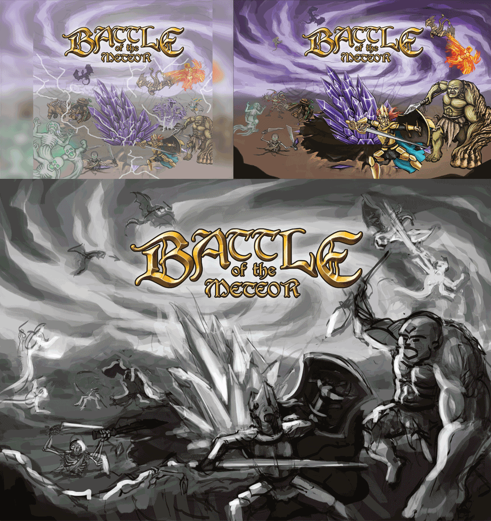
At this point the picture is starting to take form. One thing I did change after this point was the size of the crater, which felt far too small and didn’t make it look that the meteor had made very much impact. I made a few minor changes in placement after this but the main work left at this point was the polishing and detail work. This process is less interesting to write about since it mostly involves focusing on each area and giving it its fair share of work and detail. You can see that not much actually changes between the frames below except the level of detail and coloring.
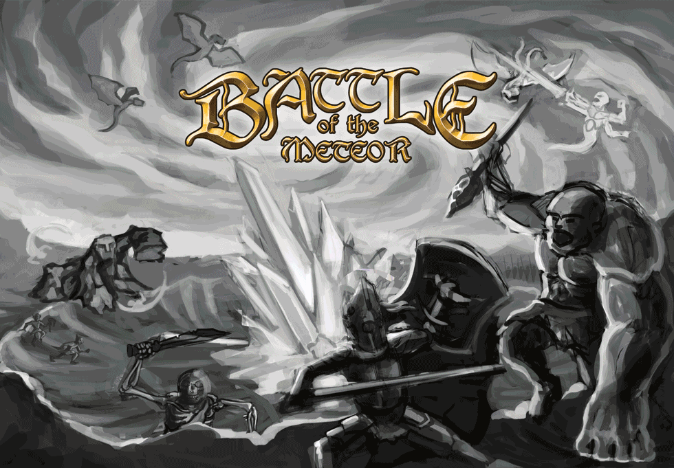
I’ll show you one more image that illustrates how I, in the last part of the process, spent more time on making sure the lighting looked nice. I wanted to make sure that the viewer gets the feeling that the crystal meteor emanates power and energy so I tried to make it cast light on all other objects in the scene. Even though many different creatures are fighting in the image I needed to give the impression that everything somehow revolves around this powerful artifact in the middle so it was important that it made an impact despite all the action around it. The lighting change is most notable in the foreground and in the meteor crater.
This was a long post. Thank you if you read all the way here. I think it may be good practice for me to walk through my process more thoroughly like this and I hope that I may teach someone else something at the same time. I hope you enjoyed this step-by-step of my painting process and make sure to mention if you want me to make more posts like this!